15 famous logos with a secret message you never noticed
You know most brands thanks to their logos.

These logos are never truly an innocent means of communication. In fact, they always represent something real or have some link with the company they represent.
There is some meaning behind every line and color, which until now has escaped you. That’s why we are deciphering 15 famous logos for you.
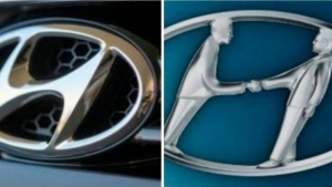
1. Hyundai

Why did they choose this logo? Although some people think that this is logically the first letter of the South Korean brand’s name, they are only partly right. In fact, the primary significance of this logo represents two people shaking hands, a customer and a representative of Hyundai.
2. Adidas

Although the logo has often changed, the current one has three stripes in the shape pf a triangle. This symbolizes a mountain, an image to represent the challenges that athletes must overcome to achieve their goals. As for the brand’s name, it is derived from the name of the founder, Adolf Dassler.
3. Apple

The designer, Rob Yanov, had the onerous task of coming up with the company's logo. After several aborted attempts, he decided to buy a bag of apples and start his project anew. But he had trouble coming up with anything. Finally, he took an apple and bit into it. While it sat there, he couldn’t stop looking at it. Rob Yanov realized that a “bite” in the apple sounded just like the computer term, "byte". This is how the famous bitten apple logo was born.
4. Sony Vaio

Everything in this logo was carefully thought out. In fact, the "V" and the "A" make up a wave symbolizing an analog wave. And the "I" and the "O" represent a "1" and a "0", the numerical symbols of the binary computer language.
5. Amazon

Upon first glance, there’s nothing very extraordinary about this logo. But its meaning goes beyond first glances. In fact, the arrow symbolizes a smile, something they want the customer to have when ordering from Amazon. In addition, the same arrow starts at the "A" and ends at the "Z." This symbolizes that you can find everything from A to Z on their site!
6. Baskin Robbins

For anyone who doesn’t know, Baskin Robbins is a chain of ice cream stores. The pink parts in the logo represent the number "31," exactly the number of ice cream flavors the company used to be famous for offering.
7. Toyota

A cowboy, a bull, two ovals ... There have been many ideas as to where this logo came from. Toyota decided to reveal its meaning to us. It’s actually a needle with some thread passing through it. What does this have to do with the car company? It symbolizes Toyota’s past, which used to produce weaving machines. In addition, all the letters of the company’s name are also drawn within the logo, as shown in the drawing below.
8. Continental

This tire manufacturer has gone with a very plain style. Nevertheless, the first two letters represent a tire and a rim.
9. Formula 1

The "1" in the Formula 1 brand logo isn’t where you imagine it would be! It is actually in the white part between the black "F" and the red fringe pattern. The red bands, meanwhile, symbolize the remarkable speed that F1 cars can attain.
10. Pinterest

This famous social network allows people to "pin" images they find on various social networks, and it has a relatively simple and plain logo. But did you notice that Pinterest's "P" was a pin?
11. Beats

A great American manufacturer of audio products, Beats uses a logo that was directly inspired by the old Walkman headphones. In fact, the red represents the foam of the earpads, and the white part is the headband, which was often made of plastic or metal.
12. Toblerone
Toblerone is headquartered in the city of Bern, Switzerland. This city is also called "the city of bears", hence the bear silhouette in the logo.
13. BMW

We know that the center of the logo represents the propellers of an airplane. This is a nod to the company’s history, which made tremendous growth during the Second World War, thanks to its aviation technology. But you might not know that it represents part of the Bavarian flag, where BMW originated.
14. LG
The company’s goal is to be simple and human-oriented. This is also reflected in its logo. The South Korean company has incorporated a face in the logo, which helps it remember how close it is to its customers.
15. Evernote

Does an elephant’s memory bring anything to mind? For Evernote, that was exactly the idea the company had. This note-taking app doesn’t forget anything at all. And the elephant’s ear folded over the logo symbolizes the fold that people often make in their books to mark the point where they left off in their reading.
Bonus: Coca-Cola

There is nothing intentionally camouflaged in this logo. However, the American company had a revelation when it realized that the Danish flag had unexpectedly shown up in its logo, between the letters "O" and "L". In fact, the company has made it a part of the marketing campaign in the Scandinavian country.

By Straker Julia
Writer
Passionate about writing, I write articles on the subjects that I love. Creativity and Animals themes are my favorites!


