17 photos of design fails that actually got the OK to print
Some graphics errors unfortunately get approved and printed.

To err is human, but some things shouldn’t get the approval when it comes to an ad that will be displayed in the streets.
Here are 17 photos that show how some designers ultimately failed.
1. An ad that tries to convince people of the magic of yoga
2. A bus that looks nothing like the ones we know

3. Stuffed animals that are sold in stores with serious sewing flaws

© yonitinoy / reddit © daydreaming_doofus / reddit
4. You either have to zip the purse or carry it – there’s no in between.

5. She’s spreading butter on her hand and doesn't seem to care.

6. Packaging where the colors used make it a little hard to read

7. It’s hard to shoot an arrow with a bow when you’re not even pulling on the string…

8. How does Spider Man not spill his coffee?

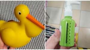
9. There’s a measuring scale on the bottle, but the bottle isn’t transparent.

10. This hammock says it can only hold one person at a time – while showing a picture of 2 people.

11. The spoon is holding some invisible cereal.

12. The fruits, vegetables, and pans are all out of proportion.

13. The menu at this restaurant has a few secrets…

© HELLO_I_AM_THE_BEAR / reddit
14. Somehow this waffle iron makes pumpkin pancakes!

15. It's an unknown animal, somewhat of a mix between a duck and a pelican.

16. You shouldn’t print just anything you want…

17. His headphones are not plugged into a device, but he’s listening to something!


By Straker Julia
Writer
Passionate about writing, I write articles on the subjects that I love. Creativity and Animals themes are my favorites!


