18 shockingly bad interior design fails
Unless you're experienced, renovating your home yourself is probably a bad idea.
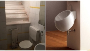
There's more to modifying a house than simply slapping on a bit of plaster or picking up a paint brush. Apart from having to deal with construction techniques, the idea is also to have an aesthetically pleasing result.
Here are 18 design fails that will make you think twice!
1. Nope, this isn't stylish
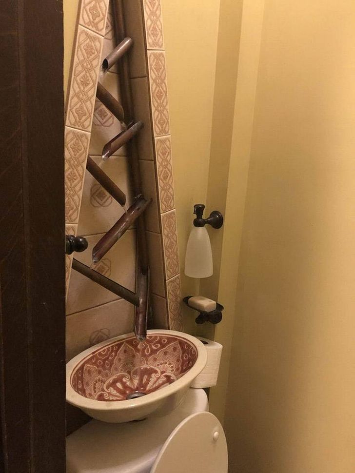
2. Definition of dangerous...
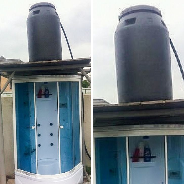
3. Because they like geometry

4. A lampshade might help to improve it
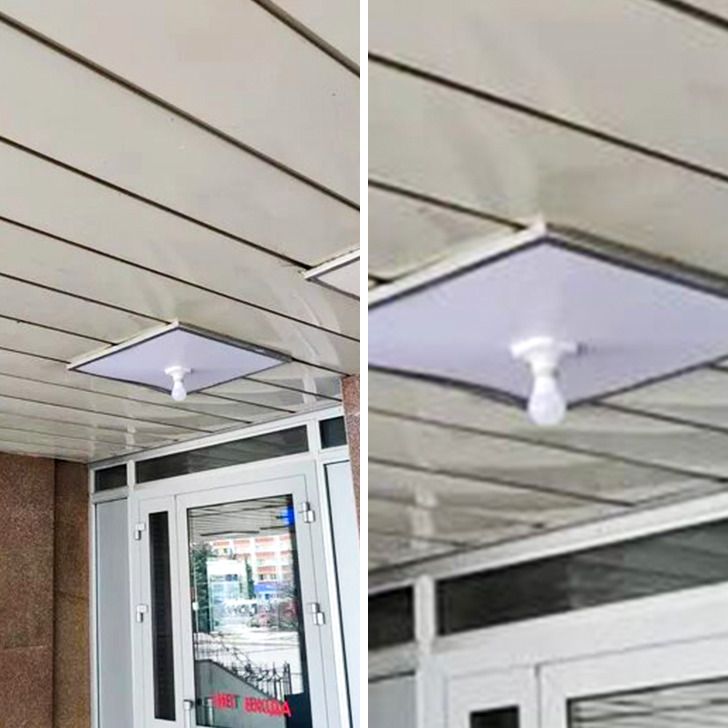
5. At least half the room will stay cool

6. No idea what was going through their mind

7. Yes, this is a staircase

8. Would you dare use this toilet?

9. Because putting toilets against walls is boring

10. Is it a urinal or a washbasin? Or both?

11. Love the view!

12. One for exhibitionists!

13. We're assuming it's a really small apartment

14. What came first, the window or the tower?

15. Carpets in bathrooms are more popular than you think!

16. Just gross

17. Customized door

18. Why create a cubicle when this will do?


By Straker Julia
Writer
Passionate about writing, I write articles on the subjects that I love. Creativity and Animals themes are my favorites!
