19 hilariously bad marketing and design fails
We don't have to have a masters degree in marketing to know that an advertising campaign is doomed, a design won't work, or that a building doesn't meet its needs. Despite everything, some professionals remain convinced that their idea is the best, putting their creative limits to the test for something that ends up as a massive fail.

The other problem is the power of social networks, and it gives us a great pleasure to share 19 of these priceless moments. Our advice to anyone planning to embark on a marketing career? Even if you think your concept is the bee's knees, we recommend you do some consumer research before your idea is launched or built.
So, what about you? Which of these is the biggest disaster? Would you be tempted to buy or use any of these? Or have you ever designed something that just didn't meet the mark? Let us know in the comments below!
1. Installing this carpet in a corridor is one thing, using it for a staircase is another matter!

2. A hospital served these to patients at Halloween…

3. Meanwhile in Denver...

4. Designed to cook children???

5. Ever seen a 3-armed man?

6. An airport aquarium apparently designed to terrify anyone scared of flying across the oceans

7. This is really disturbing

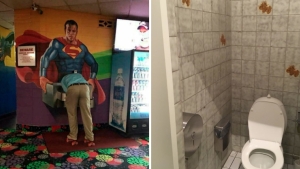
8. Interesting choice of tiles in this restroom

9. Punctuation matters!

10. A room with a view

11. Another massive grammar fail!

12. Giving a hungry child a slice of bread that's lacking bread

13. Lidl vs Go Vegan World

14. How to destroy your reputation

15. Confused emojis

16. Surely they didn't mean to use this photo?

17. This statue in a Catholic school...

18. Stay fat forever!

19. Fancy some chocolate gloop for dessert?


By Straker Julia
Writer
Passionate about writing, I write articles on the subjects that I love. Creativity and Animals themes are my favorites!


