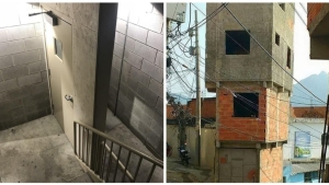
25 designer fails that defy common sense
There are creative professionals, and then there are others. There are those who have an eye for design and those who don’t. There are those who were born to be designers and architects, and those who should never have to make decisions that show their lack of skill.

It's a reality. Some people don't really have talent when it comes to designing something. So when we give these people the task of creating something, disaster is almost a given... Here are a few photos for proof.
1. It’s better to say nothing at all about the architecture of this building.

2. Close, but not quite!

3. The floor at this barber shop

4. Maybe it was built just for skateboarders...

5. Shall we have a face-to-face meeting in the bathroom?

6. When you get carried away with the size and you run out of room for the "P."

7. Why not build another room if I want it?

8. The holes might be a little too small.

9. A door and a wall with no purpose…

10. Shocked by the design on this bus window…

11. A new car brand: the Banana Car!

12. If only it was actually an effective way to sort the recycling...

13. When you can’t decide between a party and the gym…

14. Looks just like a haunted house at the county fair.

15. Not really sure what this designer had in mind…

16. In Thailand, you can get back problems just by reading the bus map.

17. This watch does tell time... when you can actually see the hands.

18. How does this work?

19. At first glance, these teacups aren’t very attractive…

20. Or how to turn a small car into something indestructible!

21. These scissors don’t close completely…

22. This butter dish hurts my eyes.

23. It's a game: it's up to you to put the letters in the right order.

24. To get to the men's bathroom, you still have to go down a long hall and turn a corner.

25. This engineering building at a university was deemed unsafe and had to be abandoned.


By Straker Julia
Writer
Passionate about writing, I write articles on the subjects that I love. Creativity and Animals themes are my favorites!


