We explain 10 symbols that you see all the time without understanding them
Every day, we come across dozens of symbols, such as the Pause and On/Off symbols on the remote control or the Adidas logo... The way they look has an explanation that will finally be revealed to you!
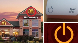
1. The On/Off button


This button is made up of an open circle and a line. It symbolizes the binary system, made up of 1s and 0s, used in computer language. When the button is on 0, it's turned off. When it's on 1, it's turned on. And just like that, you'll no longer be fooled!
2. The Bluetooth button

Bluetooth is really strange. Translated as 'blue tooth' (which means nothing), its symbol seems quite obscure, until today! In fact, the symbol is the fusion of the letters 'H' and 'B' in the Nordic alphabet, a tribute to the Danish King Harald Blåtand (or Harald Bluetooth in English) who inherited the nickname of 'blue tooth' because he loved blueberries... So now you know, and you'll be able to explain it the next time you're out with the guys!
3. The 7 spikes on the Statue of Liberty's crown

Each spike represents a continent: Africa, Europe, Antarctica, Asia, Austraila (which we call Oceania today), North America, and South America. They also represent the 'Seven Seas'. A beautiful symbol, for a statue that represents Liberty!
4. The 'M' in the McDonald's logo!

'The McDonald's 'M' just symbolizes the brand's first letter, and that's it!' If you tell yourself that, know that you're right. But you should also know that McDonald's failed to change its logo in the 1960s and that Louis Cheskin, a psychologist, discouraged them from doing so. According to him, those Golden Arches have a Freudian effect on consumers: meaning that it subconsciously reminds them of the maternal breasts and makes them feel hungry. Hungry for what? McDonald's, obviously!
5. The Mac/Apple 'Command' button

This is neither a table or a flower, or anything like that. Can you think of anything else? At any rate, you'll never guess. In fact, this symbol, created by Susan Kare for the first Macintosh was inspired by the symbol indicating historical places on the roads in Scandinavian countries, like Sweden, Iceland, Finland, and Norway...
6. The Haribo logo - 'Kids and grown-ups love it so – the happy world of Haribo'

The explanation is in the image In fact, the name 'Haribo' is made up of the first two letters of the first and last name of the creator of the colorful candies, Hans Riegel, and the first couple of letters of his hometown, Bonn! However, the story doesn't say why the brand chose Winnie the Pooh's cousin as a character.
7. The Pause symbol

Who has never seen the two little bars that symbolize the idea of 'Pause'? In fact, this little logo comes from music, where this symbol is used to... Signify a pause! Easy.
8. The Adidas logo

Until 1997, the Adidad logo had nothing to do with anything, it was sort of a striped flower... Then, Peter Moore designed it, symbolizing a mountain, like so many steps and fiddiculties to overcome... These 'steps' make you want to give even more, and preferably with Adidas on your feet!
9. The Bacardi logo

Today, the rum brand's 'bat' logo is one of the most famous in the world. But why did they choose this nocturnal animal, that's honestly quite ugly, to represent their brand? Legend says that the creator's wife saw a bat in the distillery and wanted to make it Bacardi's symbol. And that explains it all, because in Cuba, where the Bacardi brand originated, this little animal is a symbol of health, luck, and togetherness...
10. Pepsi's new logo

At first glance, there's nothing amazing about this logo. It seems simple, almost as if it's nothing at all. But in reality, it's full of symbolism: the Earth's magnetic field, feng shui, Pythagoras, geodynamics, the Theory of Relativity, etc. In short, enough complicated words that the agency of designer Peter Arnell made the beverage company pay a good million euros for this logo!

By Straker Julia
Writer
Passionate about writing, I write articles on the subjects that I love. Creativity and Animals themes are my favorites!


